01Calendar
RSVP + event crew
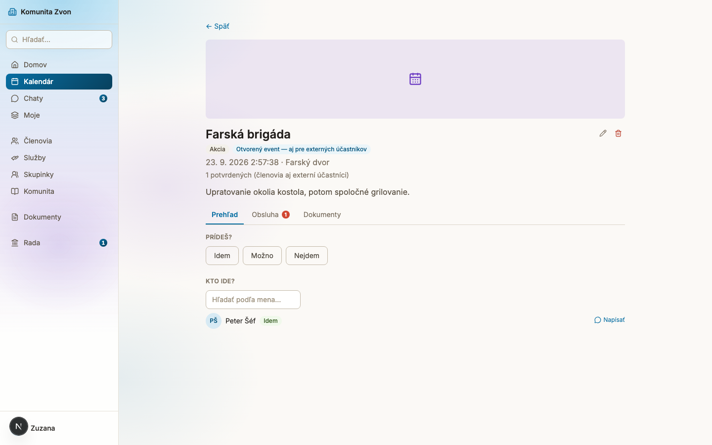
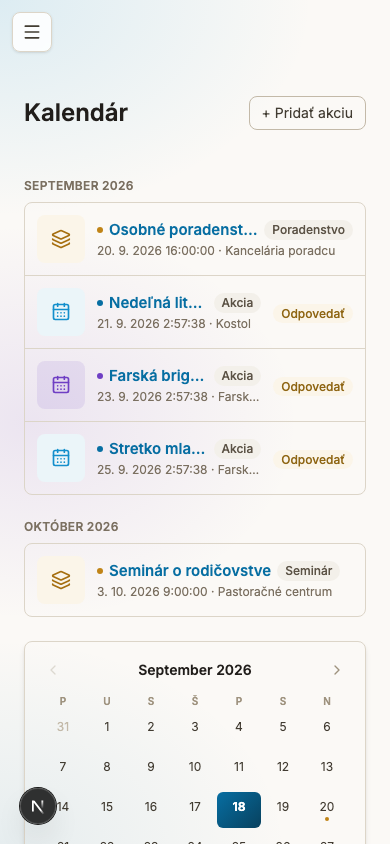
An event carries not only a date, but who is attending and who is running it that day (sound engineer, host). Signing up for a duty sets the RSVP automatically — no need to do it twice.
Communities and associations used to hold everything together with WhatsApp groups, a spreadsheet and a noticeboard by the door. We designed and built an app that replaces all of it with one place — on the web, on iPhone and on Android.
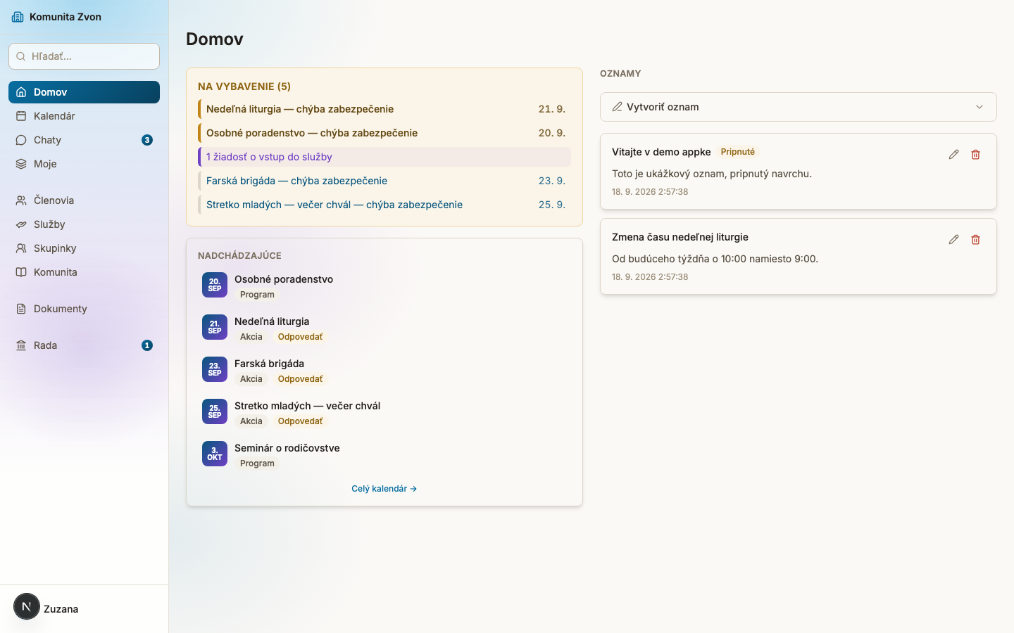
The Zvon community has dozens of members, dozens of volunteer duties (musicians, tech, cleaning), small groups, recurring and one-off events — and alongside all that it runs courses and counselling for people who are not part of the community at all. Previously this was held together by half-working tools: WhatsApp for arranging duties, a spreadsheet for course attendee lists, paper by the door for signing up to a work day.
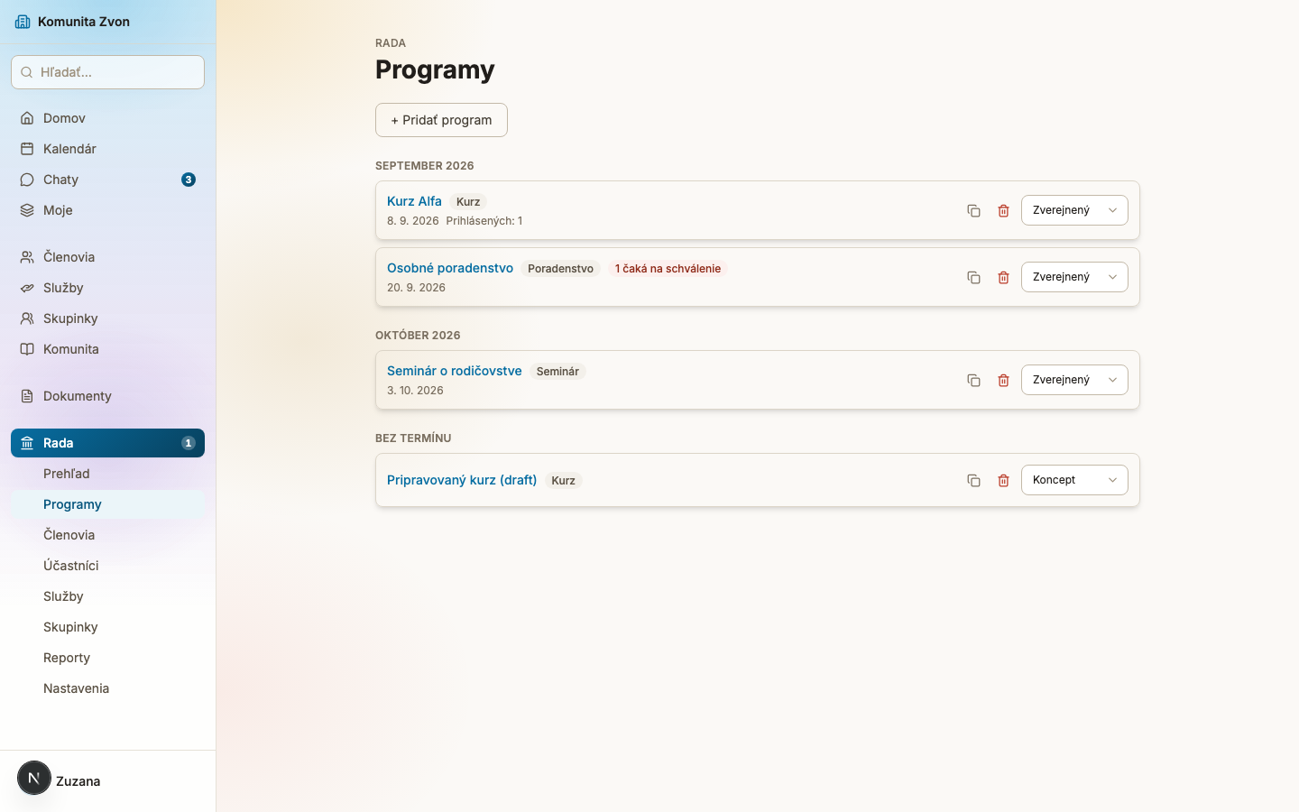
The brief was never "let’s build an app". It was: design two separate but connected worlds — community members and external programme participants — so they never get in each other’s way, yet can be linked where it makes sense (a member running a course for outsiders, for example).
Every module has to answer a question the community actually asks — not mirror the shape of the database.
An event carries not only a date, but who is attending and who is running it that day (sound engineer, host). Signing up for a duty sets the RSVP automatically — no need to do it twice.
Phone, address, birthday — each member decides what the rest of the community can see. The app enforces this at the level of a single field, not the whole profile.
Events, duties, small groups and courses each get their own channel with the right access — without the app needing four different chat screens.
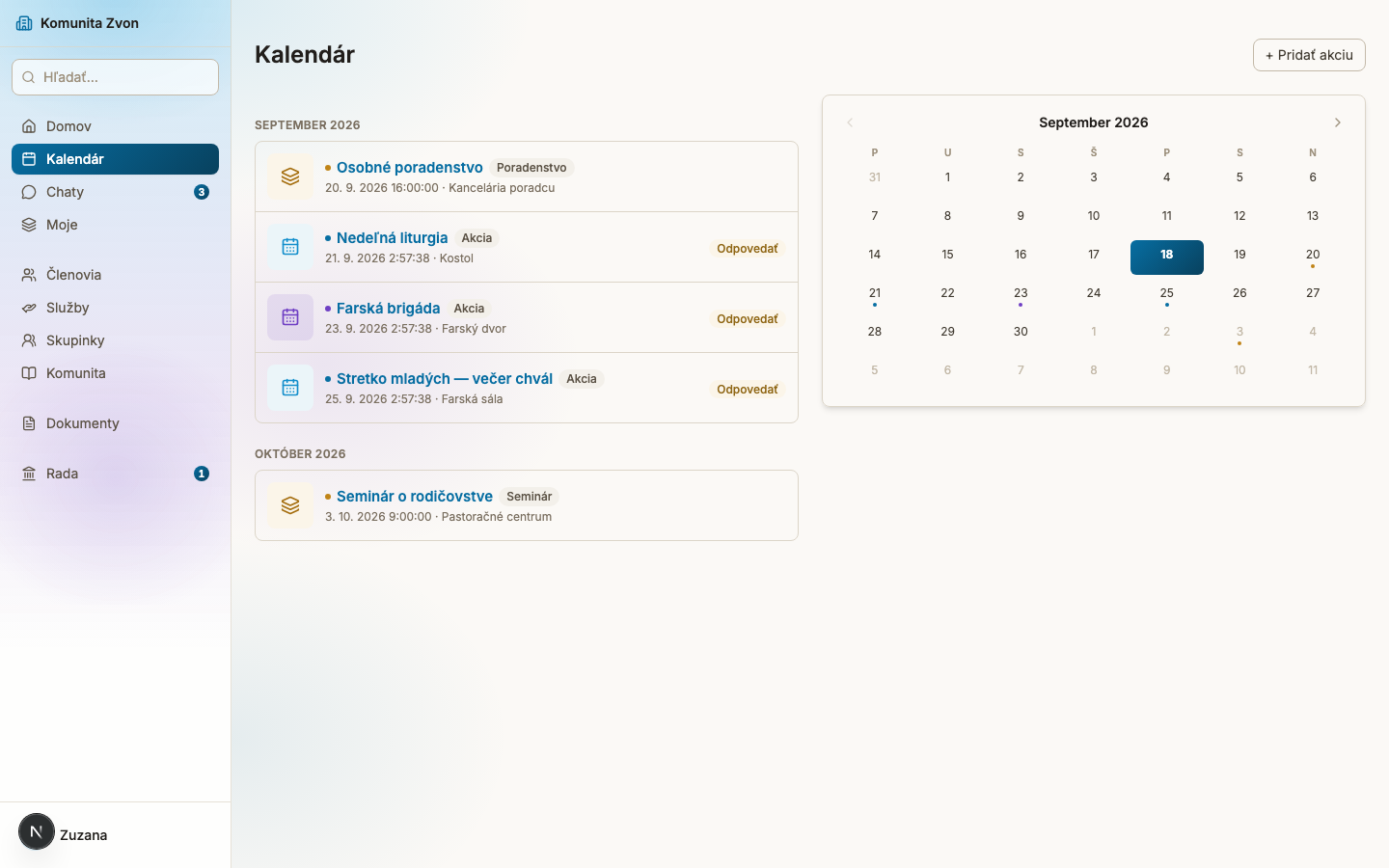
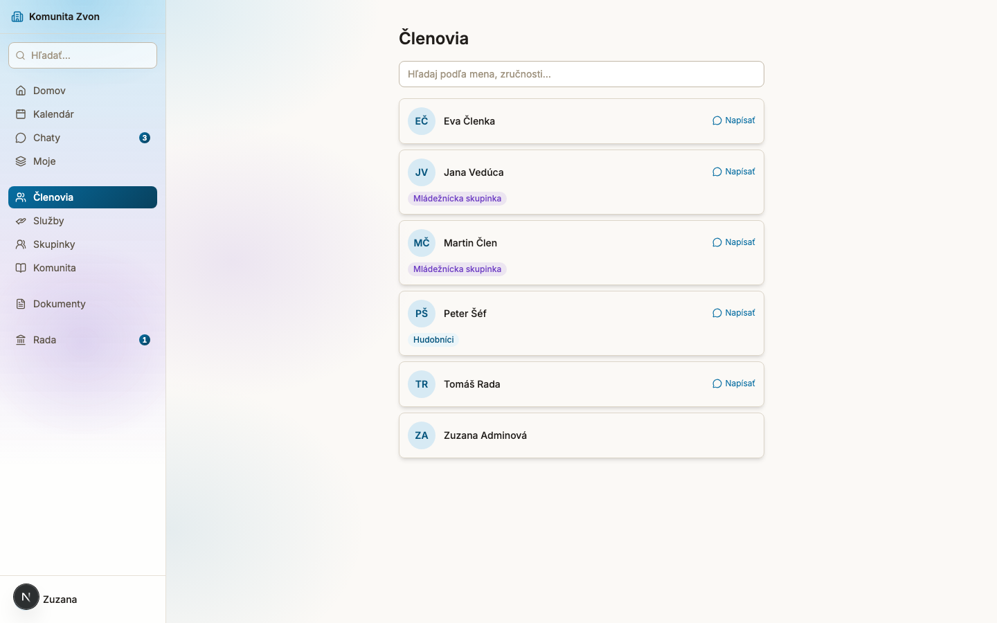
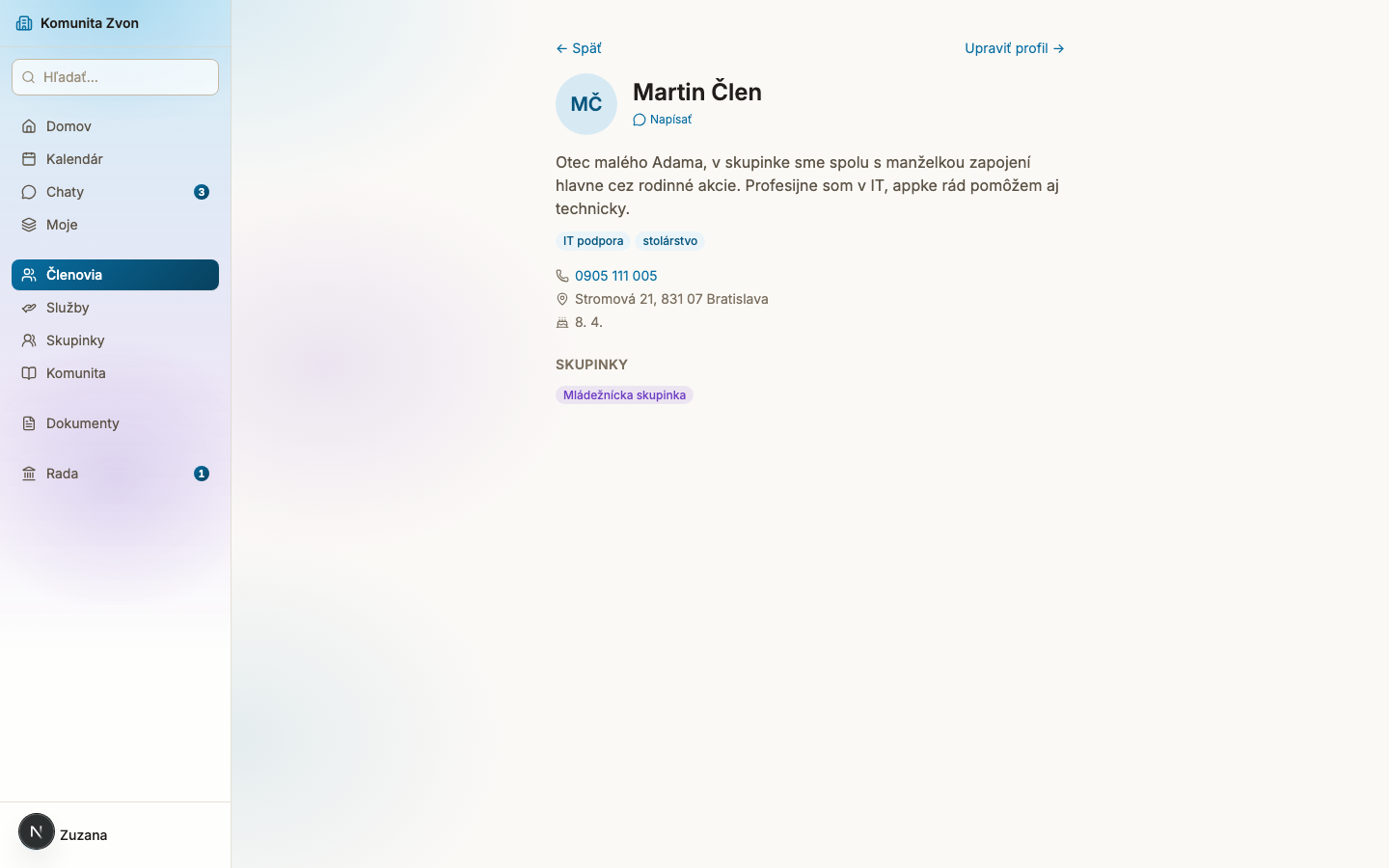
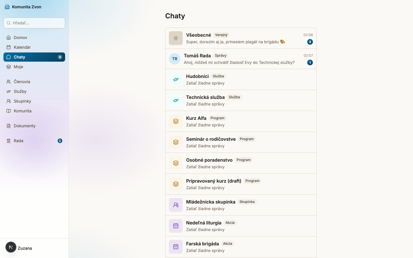
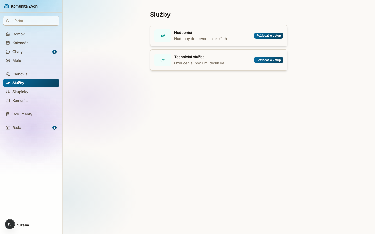
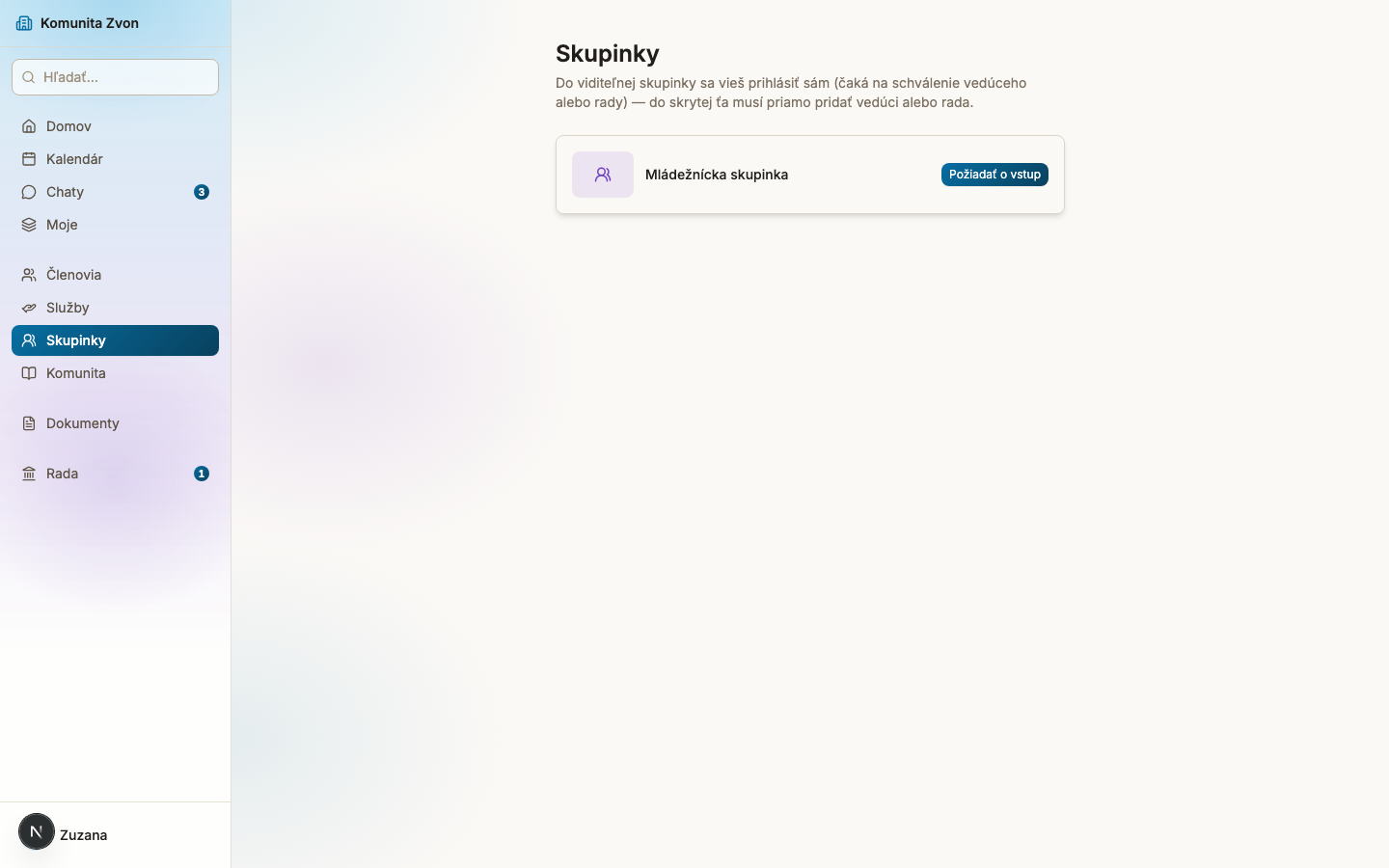
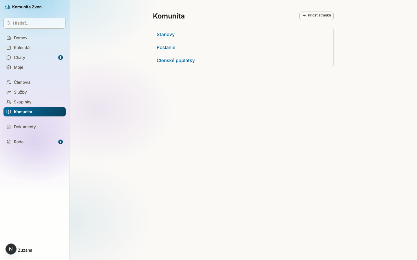
The app grew screen by screen before it had a unified look — colours, spacing and type drifted apart across web, mobile and the portal. We built a shared component library across all three apps: colour tokens, a type scale, consistent spacing and one icon set instead of emoji used as icons.
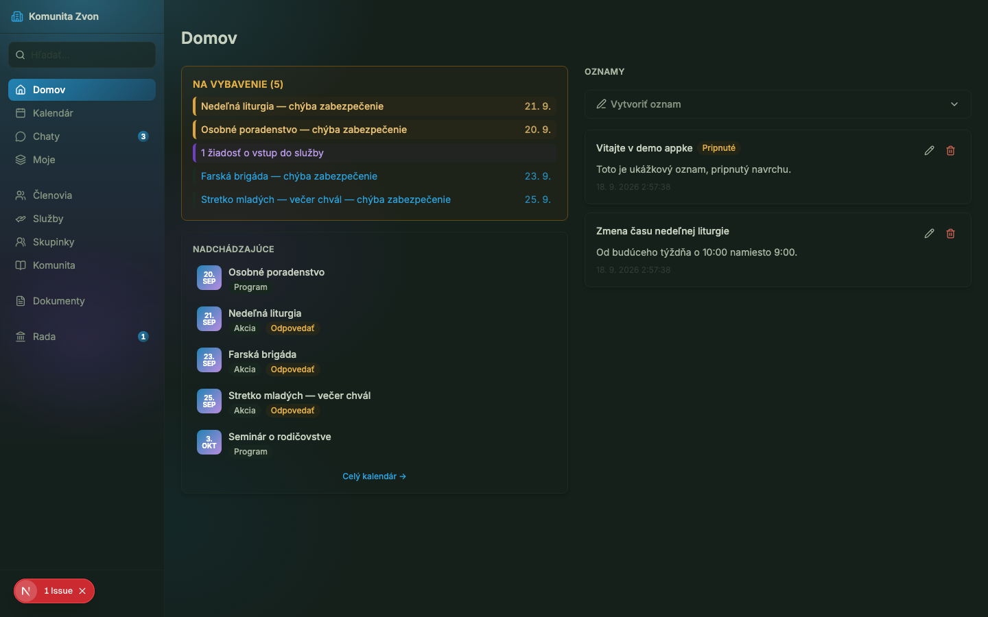
The focus was on making dark mode genuinely work — not just on the bottom bar, but across the whole screen content — and on keeping the app readable at increased browser font size, which is why the entire type scale is in rem, not fixed pixels.

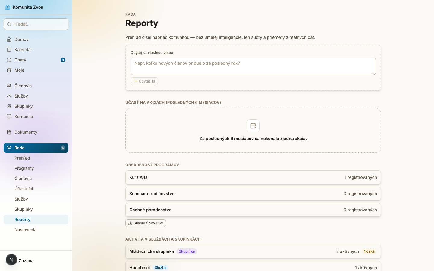
The admin area for the community council got its own reporting section — event attendance, course capacity, activity across duties, membership growth and an estimate of programme income, each with a CSV export. Plus a free-form natural-language question that picks from pre-built, community-data-aware functions — the app never lets AI near free-form SQL.
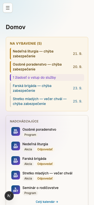
Community members live in the native iOS/Android app, not in the mobile web. The same information model as on the web — "to handle" at the top, calendar below — reworked for a thumb rather than a cursor.
Done and in production:
Product and design in one person — from the first wireframe to an app the community actually clicks through today.
A specific problem, or just a second opinion — reach out. For enterprises and growing teams alike.