01Empty states are not shown
No day without data
If nothing was charged that day, the overview card simply hides — instead of showing an empty message you have to mentally ignore every single day.
Energy is a home energy system for solar generation, EV charging and trips — designed and built as a solo product, refined through one household’s daily use rather than a design brief.
A household with solar, a home wallbox, a portable charger and an EV had all the data — just scattered across four different vendor apps and exports. Answering "was it worth it today?" meant opening four apps and doing the maths in your head.
The brief was never "build an app." It was "I want to check this on my phone in a few seconds, not dig through four tools." A purpose-built system turned out to be the only way to genuinely unify these sources instead of producing yet another spreadsheet export.
Even a product for a single household has genuinely distinct modes of use — separated not by person, but by context and the speed the moment demands.
Opens the phone for five seconds — how much was charged, what it cost, whether charging is still running.
Wants to know whether the solar investment is paying off and how much was actually saved last month.
Instead of opening the app, simply asks — "how much did I charge today?" in a chat.
Does not want to watch the app actively — the app itself reports when charging starts or finishes.
The best research participant for this product was six months of real wallbox and vehicle export data.
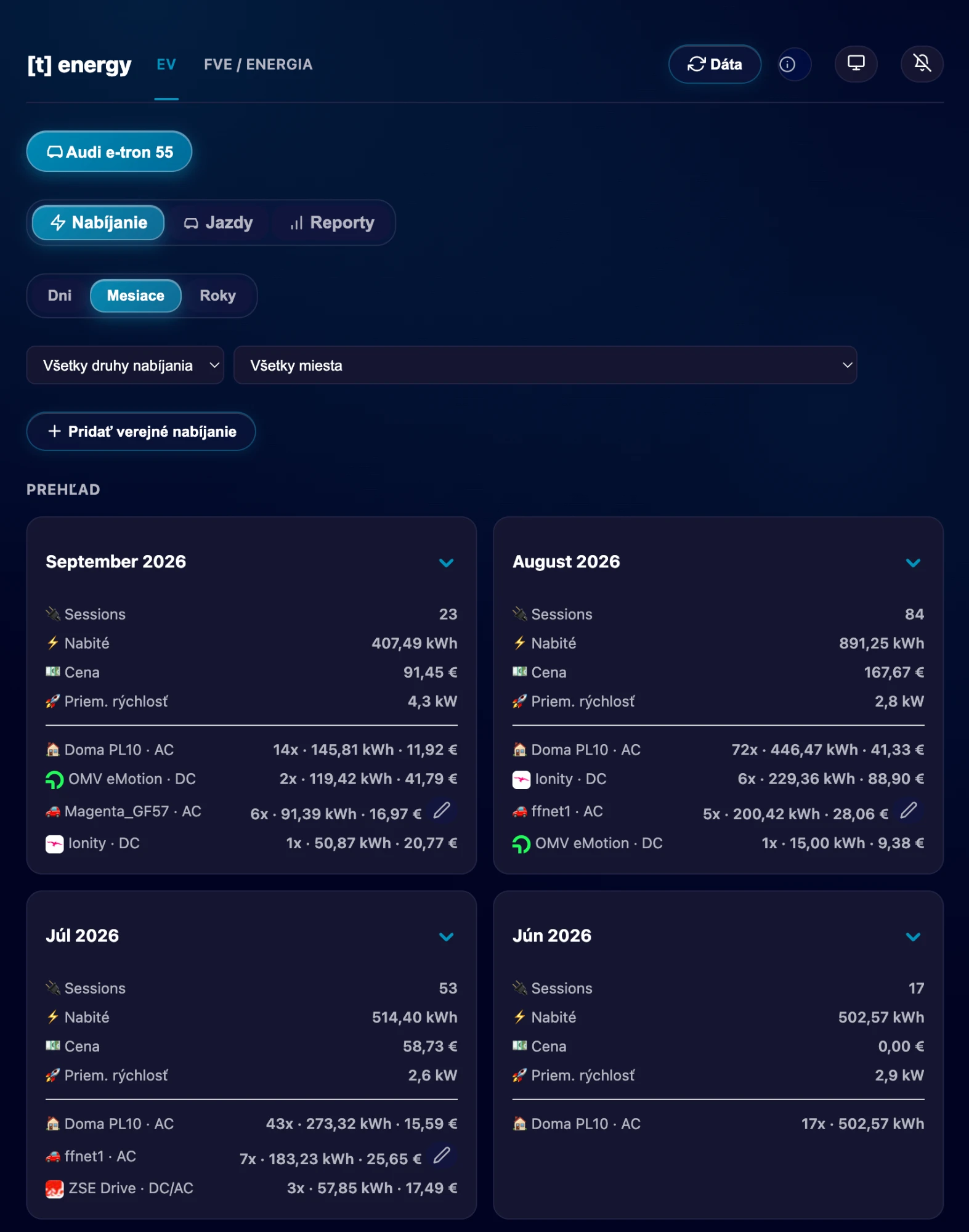
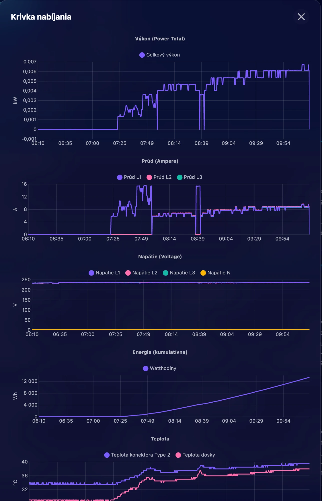
The decision that shaped everything else: charging sessions from the home wallbox, the portable charger and manually added public ones live in a single unified model, so the report, the session detail and the AI assistant all read exactly the same facts — never three copies of the same session that can drift apart.
Every module passed the same test: can this fact be shown in another context without duplicating the data? A completed session becomes a row in the report and an answer in the AI chat — never two different numbers.
The primary use case is a few seconds of looking, several times a day — not sitting down with the data. Four rules did most of the work:
If nothing was charged that day, the overview card simply hides — instead of showing an empty message you have to mentally ignore every single day.
When the app knows a charging network’s logo, it replaces the generic "public" icon with it — telling places apart visually, without reading text.
The charging list shows a shortened address for fast scanning; the full address, note and average power only appear in the session detail.
A decimal comma instead of a point across the app and in charts — a small detail that decides whether the data feels like "ours" or like an export from a foreign system.
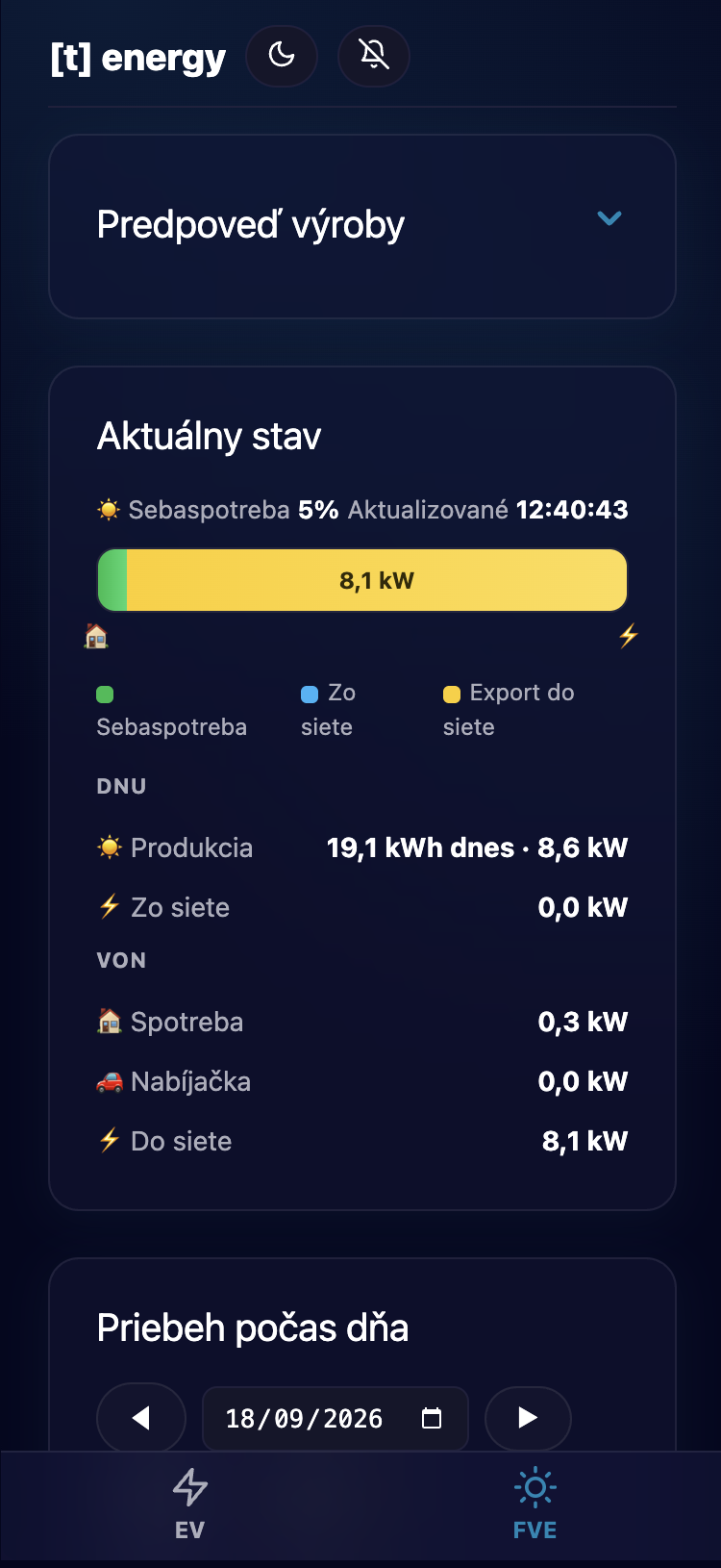
A dark design with "liquid glass" surfaces — established energy-monitoring tools as the reference point for calm, readable data, with a saturated azure accent instead of the usual "eco green".
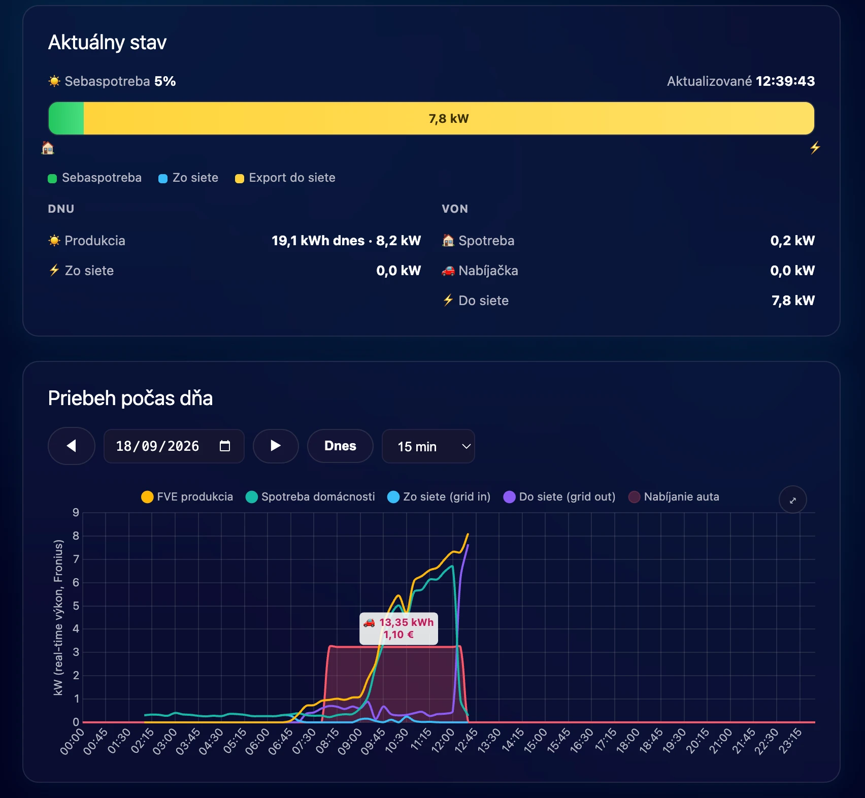
The primary device is the phone — so the app got native behaviour instead of a browser page: its own home-screen icon, a fixed bottom tab bar, and push notifications when charging starts and ends, so the app never has to be opened actively.
The second interface is not a screen at all — it is a chat. A curated, read-only subset of the API is exposed as a tool for a chat assistant, so you can ask "how much did I spend on charging this week?" without opening the app.
No separate design phase — the app was changed directly on the server and verified in a real browser or phone within the same conversation that raised the request.
It started as a suspicion about my design change. Only a real screenshot with a 1,700 kW spike showed it was a data problem, not CSS.
Every URL worked through curl, but the actual cause — a duplicated path — only surfaced in the browser’s DevTools window.
A simple question about one missing price led to comparing two data sources and uncovering a six-day overlap.
Building an app you will open tonight to check your own charging removes every layer of proxy research. The price is that there is nobody to blame for a bad decision — which is exactly why the app would rather hide an empty state than show something untrue.
A specific problem, or just a second opinion — reach out. For enterprises and growing teams alike.